Sales Insights using MySQL and Tableau
Querying and Visualization Demonstration • 2020 • Independent Project
Background
This project was completed as a final portfolio project for my semester long SQL class as part of my data science track for my masters degree. For this project I downloaded a sample database from Dhaval Patel that contained 150k columns of sales information from a technical hardware company.
Goal: To showcase my knowledge of data mining and data cleaning in SQL and Power BI and also translate that knowledge into data visualization using Tableau. The main goal of this project was to mimic common projects found in the workplace as a data analyst.
SQL Insights
For this project, SQL was used to gain familiarity with the database and see what was needed to be cleaned. I primarily looked for any negative integers that seemed out of place, currency types that did not fit, and also the averages and sums of different sales by year. You can check out the SQL code in my github which is linked at the bottom of this page.
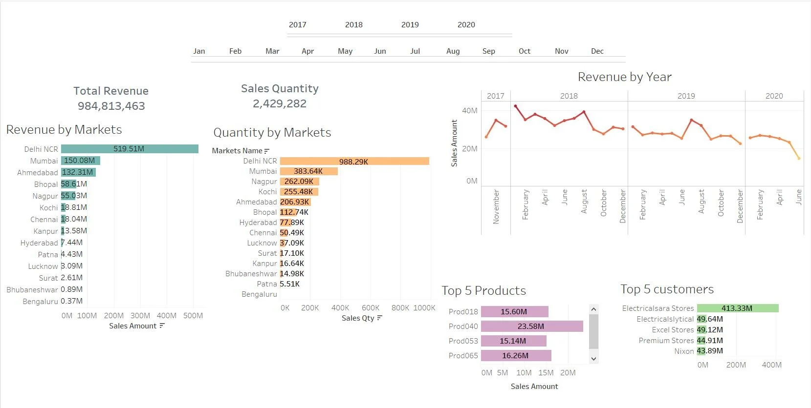
Tableau
The first step in tableau was to create a star schema with transaction types as the fact table. Next I cleaned the data by filtering out transactions that had errors such as sales that were “sold” for -1 or 0.00. The next step was to convert all of the transactions into Indian Rupees as it was the most common transaction in the dataset. This required me to code for the correct and updated conversion of currency and command tableau to filter the USD transactions into proper INR transactions. Usually this is optional but because I was searching through the sales I wanted to make it a cohesive chart.
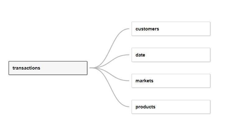
Star Schema for Tableau Dashboard
As you can see in the dashboard, the revenue for the company has fallen sharply in 2020, so it was also important to understand how that changed in terms of customers and customer spending. I created seven worksheets in total to add to my dashboard. The entire dashboard is shown below or you can click the button to visit the interactive version.
The best part about the interactive version is the filter system I used when finishing the dashboard. You can view revenue trends by year, customer, top product, and market with one simple click. This was created to mimic the way I would use Tableau in a workplace.